Adaptive
Telemetry
Workspace
I N D U S T R Y
Industrial Telemetry & Test Data Stack
T O O L S
Figma, Claude AI, React, Grafana, JSON, Dify.AI
R O L E
Product Designer
D U R A T I O N
Jan 1 — Jan 22, 2026
Reducing dashboard setup by 60–80% using automation.
01
OVERVIEW
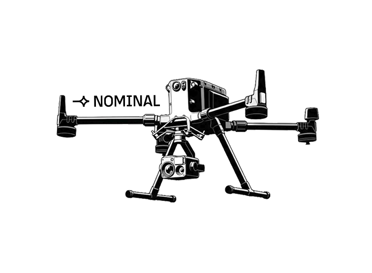
Nominal IO builds the essential software stack for hardware test teams. Engineers use their platform to monitor, test, and deploy hardware systems ranging from autonomous drones to rockets.
02
PROBLEM
Dashboard setup is a manual bottleneck that costs engineering hours before a single test runs.
4–7 hours of :(
PER DASHBOARD · BEFORE ANY TEST DATA EXISTS
Discovering &
mapping sensor
signals
Configuring
threshold alerts
for safety
monitoring
Binding data
streams to
visualization
widgets
Debugging query
syntax & data
formatting
Setting up units,
colors & display
preferences
WHY IT MATTERS
For teams running 20+ tests per quarter, this adds up to 100+ hours of work per quarter. Time that could have been spent on actual hardware analysis.
OBJECTIVE
Can we simplify hardware-telemetry dashboard setup while preserving accuracy?
03
SOLUTION
ATW — ADAPTIVE TELEMETRY WORKSPACE
ATW replaces configuring and querying panels with filling out a form.
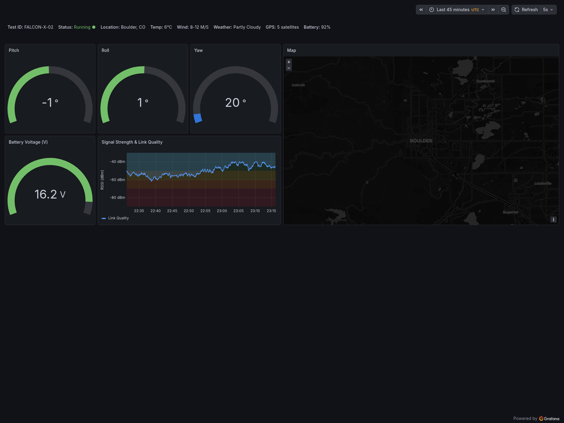
Hardware tests have Test Plans, a document engineers write before every test that defines everything a dashboard needs. ATW guides users to input that information into structured, clear prompts. AI agents then turn that information into JSON code, which is converted into a dashboard visualization.
Onboard
Users start by creating prompting documentation from scratch, or using a template.
Blocks map to panels
Each block users fill out is an individual prompt that corresponds to a panel in the final dashboard.
Generating dashboard
A five-agent workflow takes in the prompting documentation and generates an editable dashboard.
04
RESULTS
✓ WHAT WORKED
60–80
%
ATW generated dashboards roughly 60–80% complete. Needing only minor edits during review to get fully working. For engineers, that translates directly into 60–80% less setup work for every test they run.
△ THE TRADEOFF
COLD START
Templates for prompting documentation and context libraries need to be built first. This raises the barrier to entry. ATW has to be in use before it's fully useful. But for companies testing similar hardware, the payoff compounds with every test.
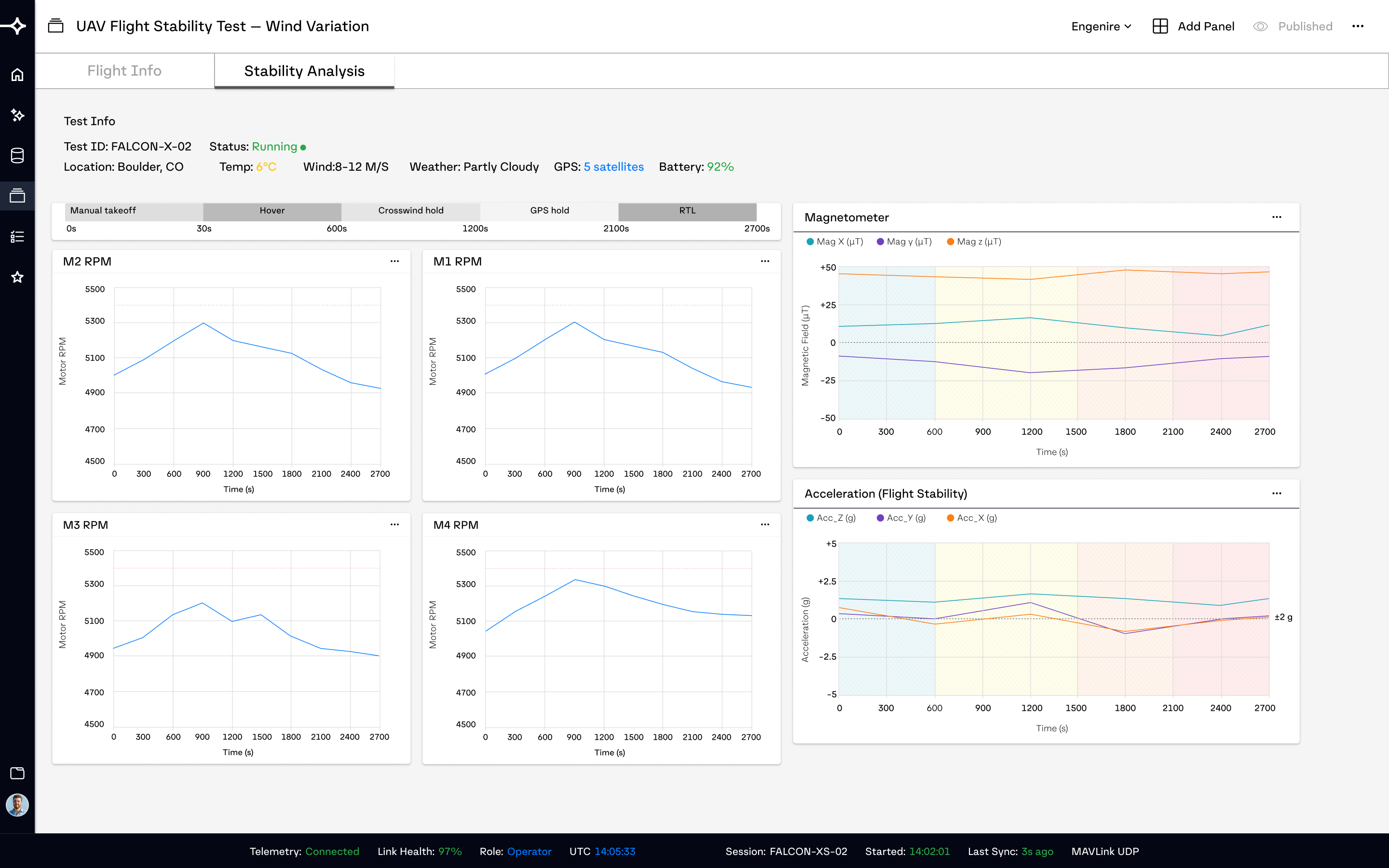
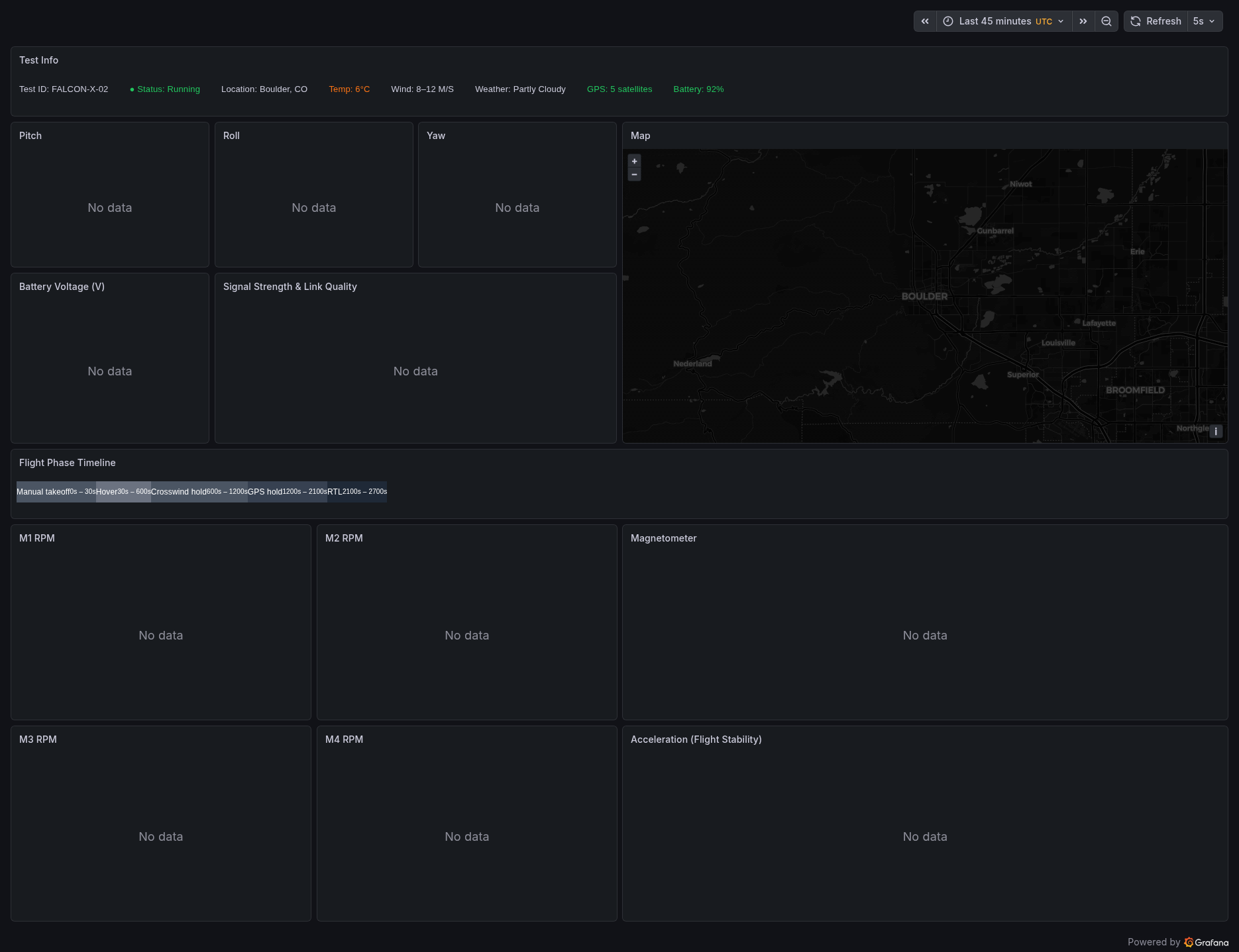
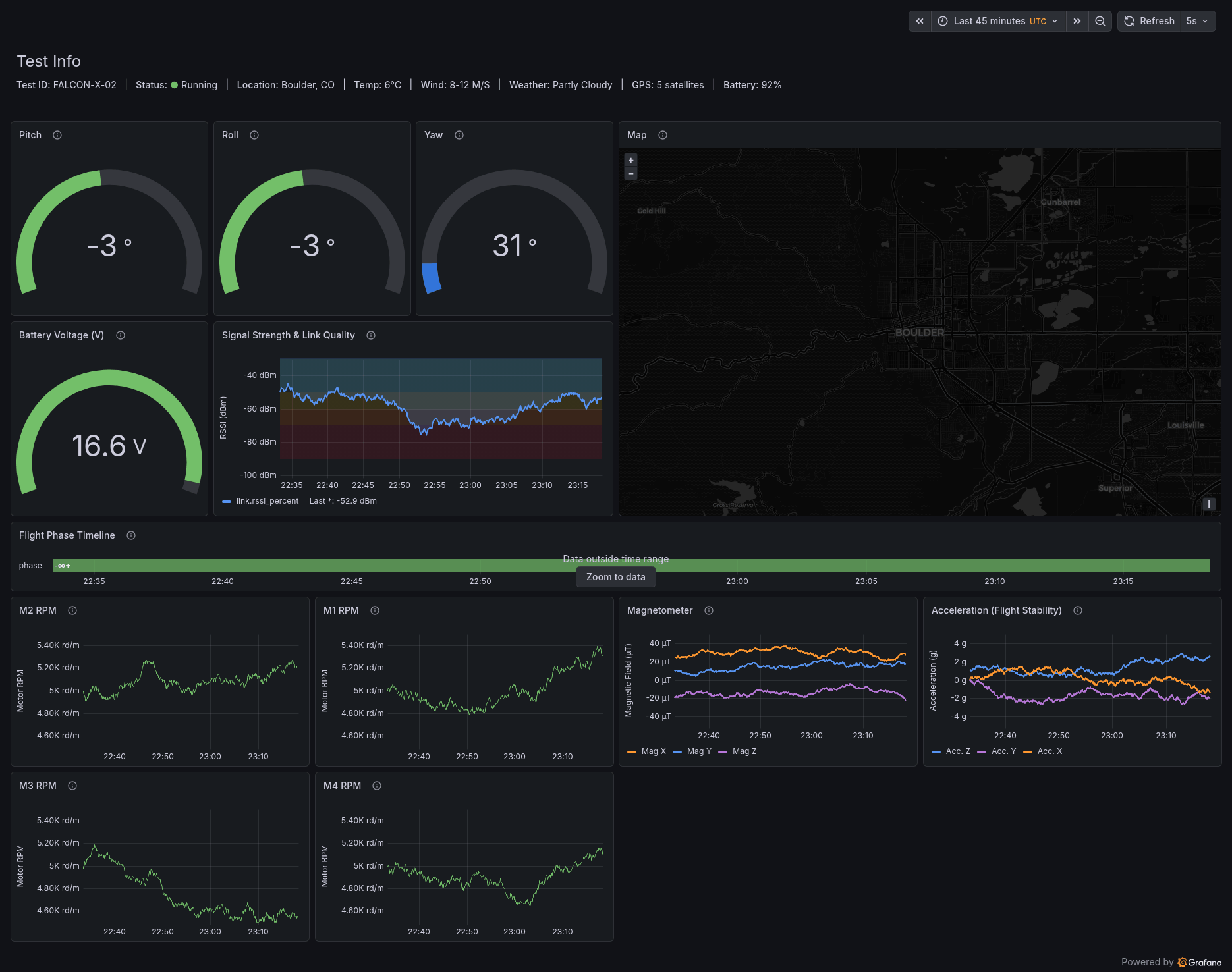
The demo was created by using a simple UAV flight test , with a preexisting test-plan. The workflow was verified end to end with Dify.AI and Grafana.
05
PROCESS
How did we get here?
The project was inspired by my curiosity around the application of AI in complex systems. I wanted to see if building a usable dashboard for hardware testing, which has many complex layers, was possible with AI.
After jotting down some ideas, I had some questions to answer: would automation be useful here? If so, what have others done about it? I spoke with engineers who've used dashboard tools like Grafana and Nominal IO. One frustration came up every time, and this quote captures it best.
"I wish the querying was more consistent."
— DEVIN, SOFTWARE ENGINEER · LINKEDIN
Many junior and even senior engineers struggle with querying. Since each data source has its own query language, the difficulty is less about technical skill and more about domain knowledge. Sometimes Engineers simply haven't been exposed to that specific language yet.
Things only get worse for hardware Engineers.
an engineers has to deal connect senseor which have varying formats, A dashboard isn't just sensor feeds it has to reflect the test objective, the environment, safety thresholds, and alert behavior. Every one of those layers has to be configured by hand, every time. NASA's Intelliviz research flagged this as its own bottleneck, significant enough that they funded dedicated research just to reduce it.
https://techport.nasa.gov/projects/6892
COMPETITIVE ANALYSIS
To understand the landscape, I analyzed how the two leading dashboard platforms approach automation.
Grafana
A powerful dashboard tool with enormous flexibility and use cases. Users can generate dashboards via JSON imports.
△ WHERE IT FALLS SHORT
Useful at scale — but for a single dashboard, writing the code takes longer than building it by hand.
Datadog
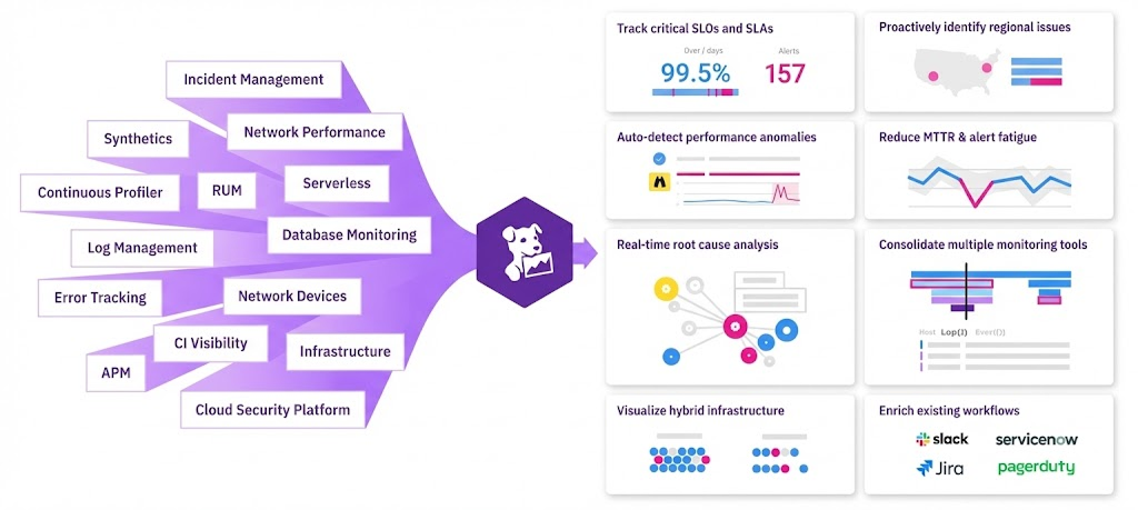
A popular dashboard tool known for ease of use and a low barrier to entry. It automatically applies connected data to templates, generating dashboards quickly.
△ WHERE IT FALLS SHORT
Its rigid templates can't capture test-specific safety thresholds and hardware configurations — unsuited for hardware testing.
[ RESEARCH INSIGHTS ]
INSIGHT / 01
Dashboard visuals and thresholds can be generated directly from JSON.
INSIGHT / 02
Every hardware test is different, but they all answer the same three questions: what are we measuring, what are the safety limits, and what is the environment? Those become the building blocks for a system.
06
DESIGN PROCESS
At this point I knew the why and the what. The how was the challenge. ATW needed to reduce both user error and AI error to produce consistent, usable results.
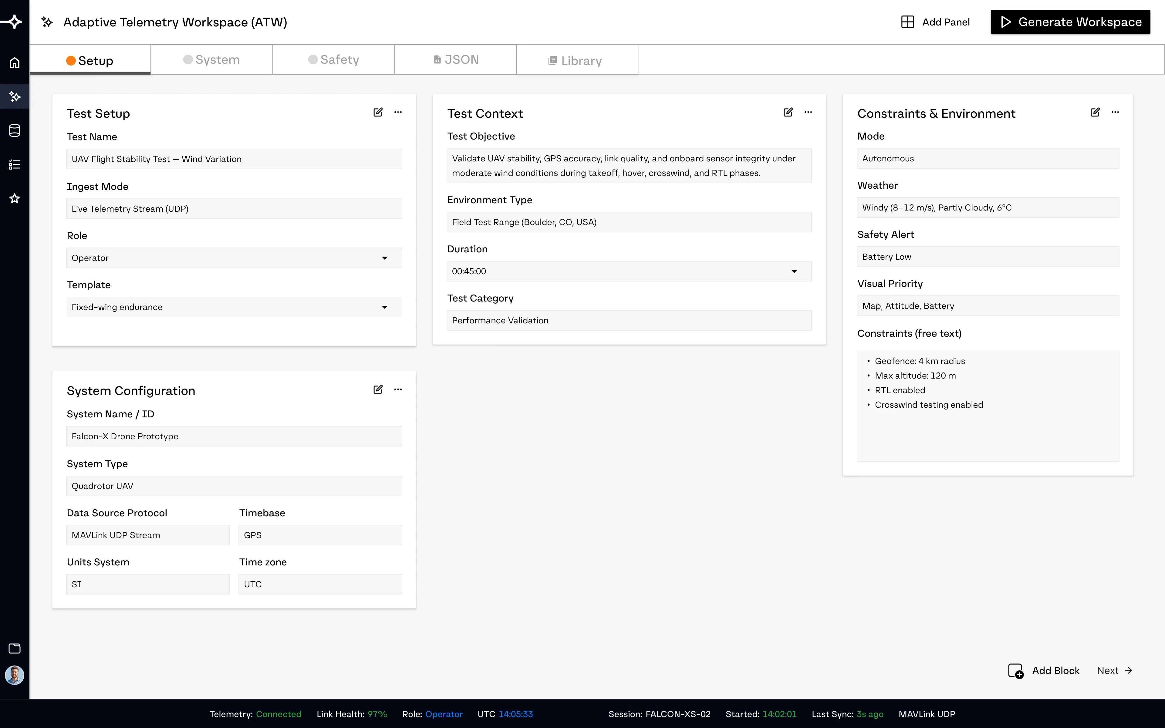
That's when I realized node-based systems like ComfyUI were exactly what I needed. Breaking a complex process into discrete, connected blocks is how they make the instructions clear and manageable. That idea became the prompting documentation: a three-page form, each page answering what almost every hardware test requires.

Setup

Everything needed to understand the context of the test.

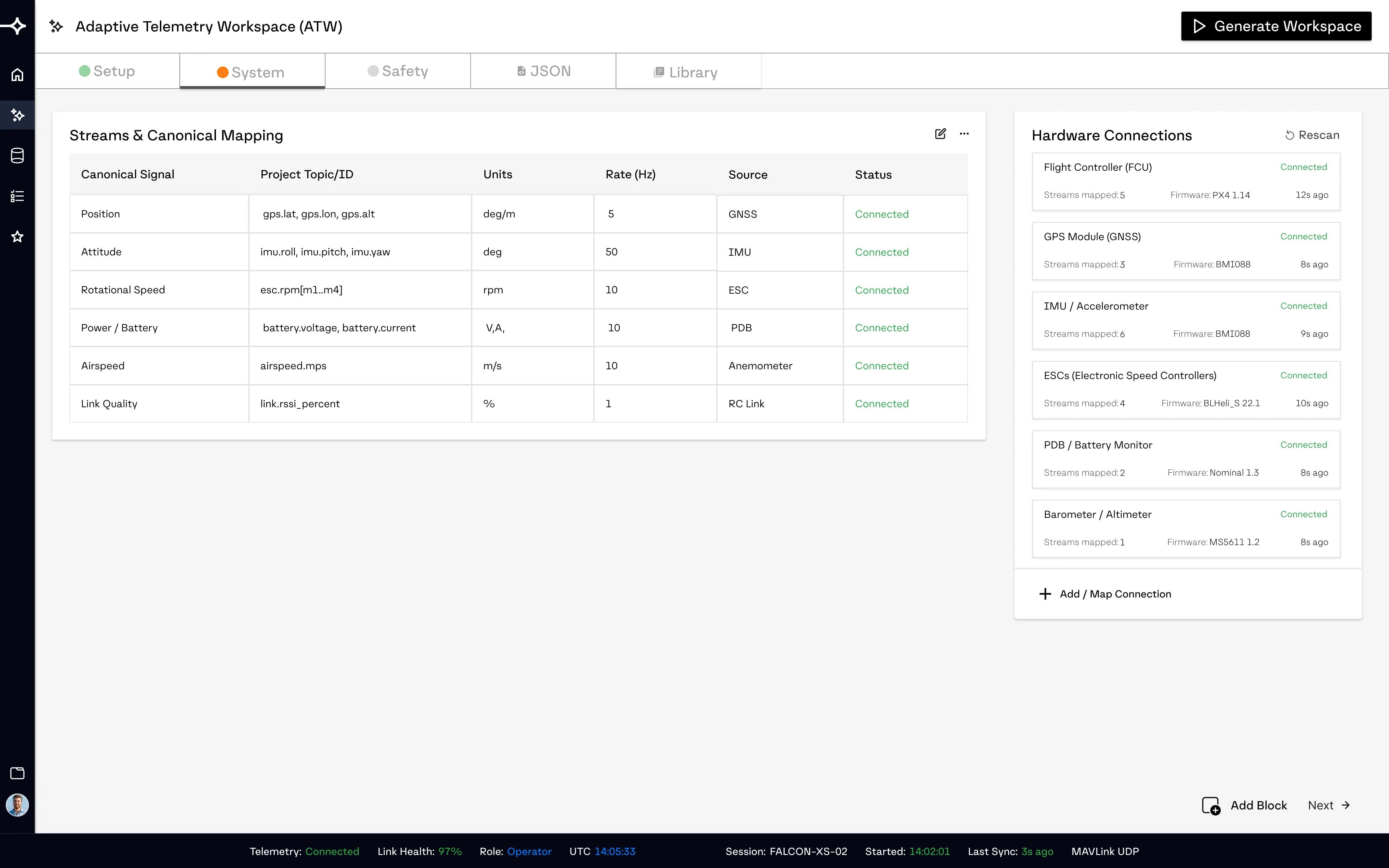
System

This is what lets the AI understand what hardware is actually connected.

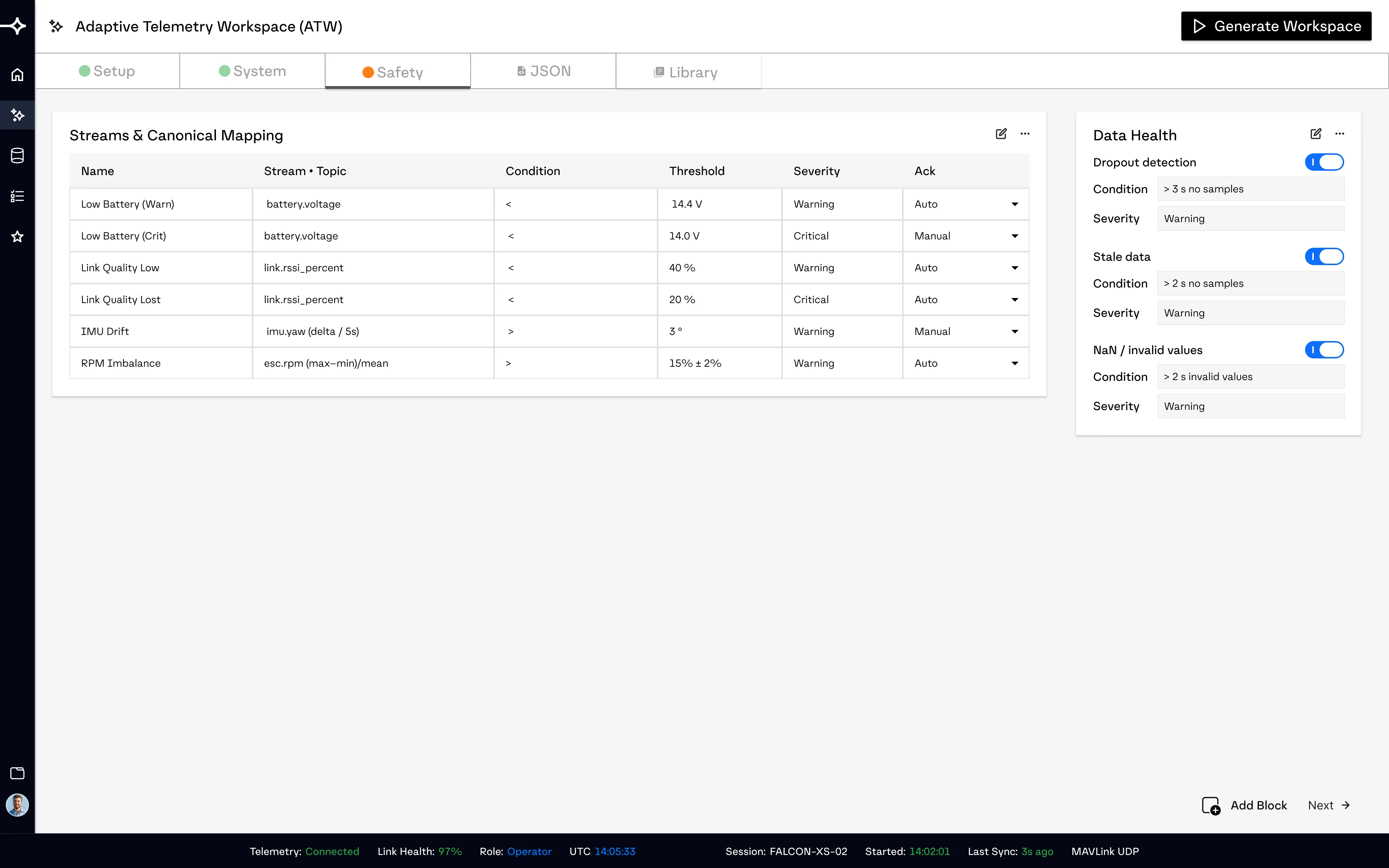
Safety

Defines what "critical" means for this specific test, so the AI never has to guess.

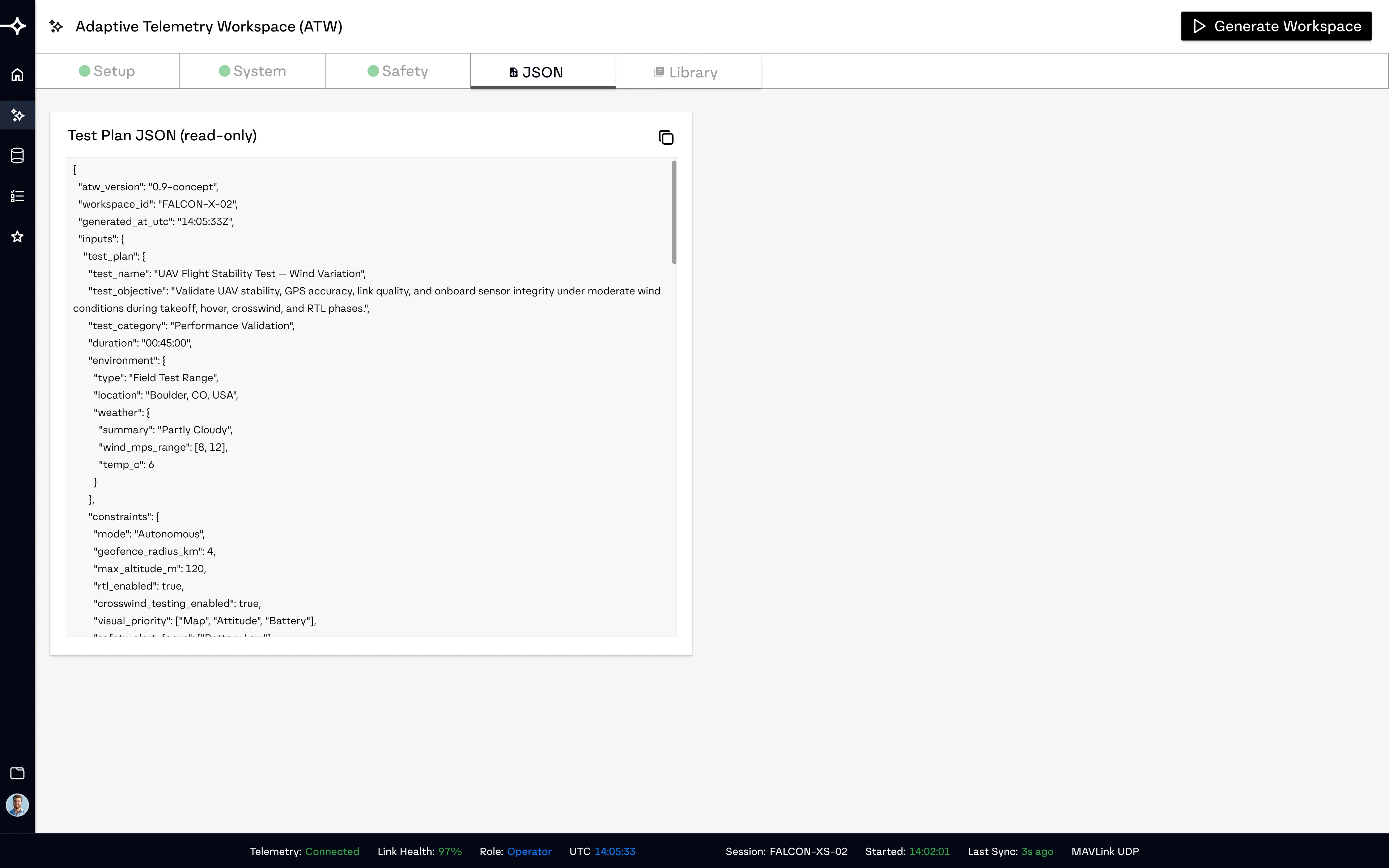
JSON

The JSON page shows engineers how their prompts are structured for the agents to read and understand.
The prompting doc had three major advantages:
A · LESS GUESSING
The form blocks constrain the input, which removes guesswork for the AI agents, they're simply translating form blocks into dashboard panels. Less hallucination, more accuracy.
B · COVERAGE & TRACEABILITY
Each block is processed one at a time, so nothing gets skipped — and every decision can be traced back to the block that produced it.
C · EASY FIXES
Because each block is isolated, a fix to one block won't ripple changes across the whole dashboard.
[ AGENTIC WORKFLOW ]
Next, I designed an agentic workflow to handle a chain of commands. Breaking it into specialized agents reduces errors and keeps the process transparent. I prototyped the chain in Dify to simulate the workflow end to end.
AGENT 01
Schema Parser
AGENT 02
Requirements Extractor
AGENT 03
Dashboard Designer
AGENT 04
JSON Assembler
AGENT 05
Documentation Generator
Dify agentic workflow
[ INITIAL TESTING ]
The first couple of tests had underwhelming results. Instead of running more tests, I stopped to understand what went wrong.
△ FAILURE ANALYSIS
The prompting documentation didn't give the agents enough context for what the values actually meant or how they should be shown. battery.voltage < 14.0V tells an agent it's a voltage threshold. It doesn't tell it what that number means for the battery, how to visualize it, or where it belongs on the dashboard.
So the agents guessed. And guessing led to incomplete, inaccurate results.
I needed a way to give the agents these small details about every value and metric, without bloating the prompting documentation.
07
THE BREAKTROUGH
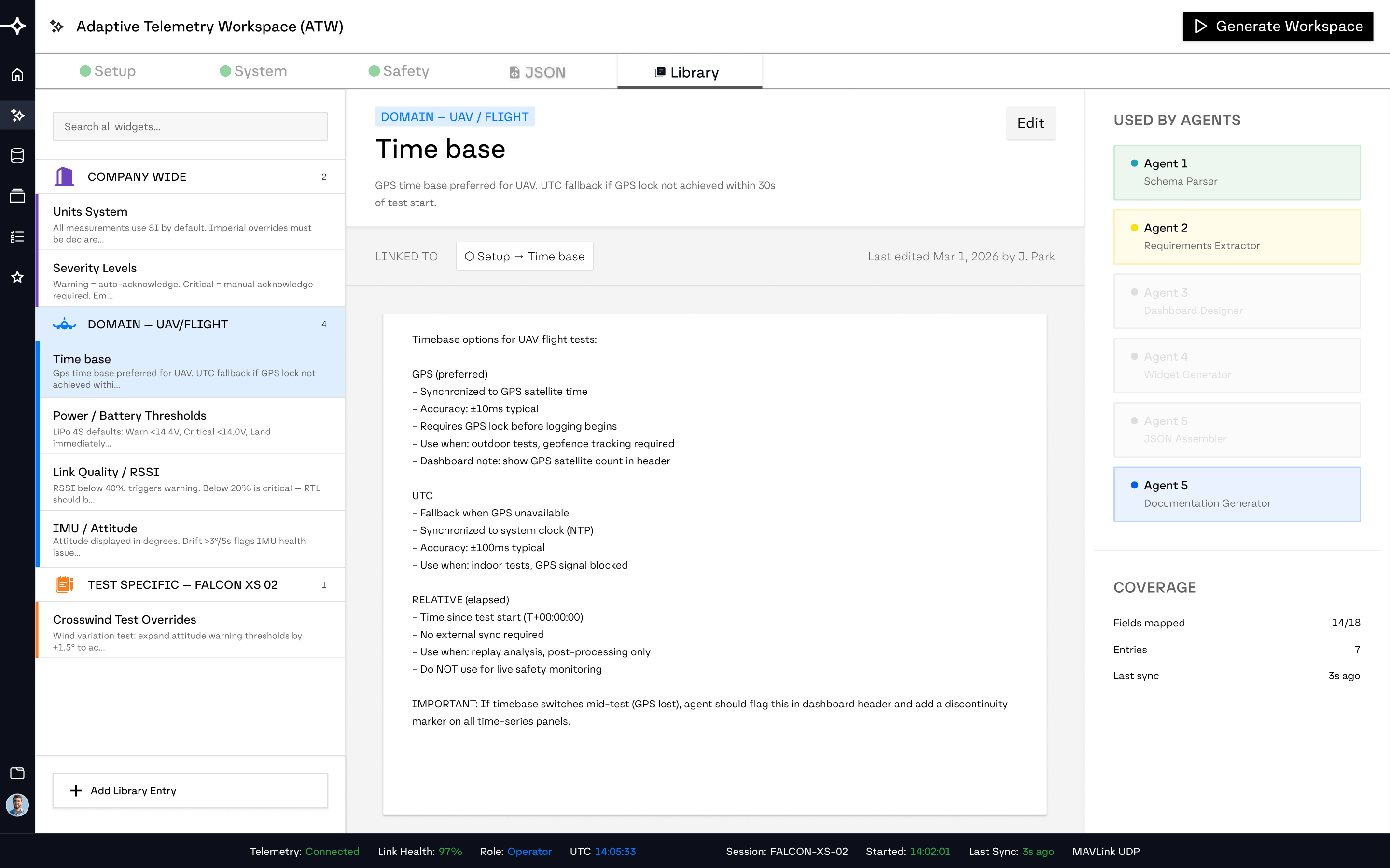
The context library
A collection of notes, created by engineers, that gives the agents vital context: what a metric means, how it should be visualized, what thresholds are standard, and what mistakes to avoid. Information that doesn't need to change between tests, organized in three tiers.
TIER 1 · COMPANY-WIDE
Unit conventions, severity definitions, data health standards. Written once, rarely touched.
TIER 2 · DOMAIN-SPECIFIC
Everything specific to UAV testing, automotive, medical devices. Written once per hardware category.
TIER 3 · TEST-SPECIFIC
Lightweight overrides just for this test run. The delta from the domain standard.
[ ROUND TWO OF TESTING ]
After adding the context library, the results improved significantly. The agents knew exactly what each metric meant and how to present it. Even across repeat runs the results were consistent. the dashboard came out about 60–80% complete each time. What was left were minor tweaks to visual clarity and a couple of more important errors, like a lack of information on the map panel.
08
FINAL DESIGNS
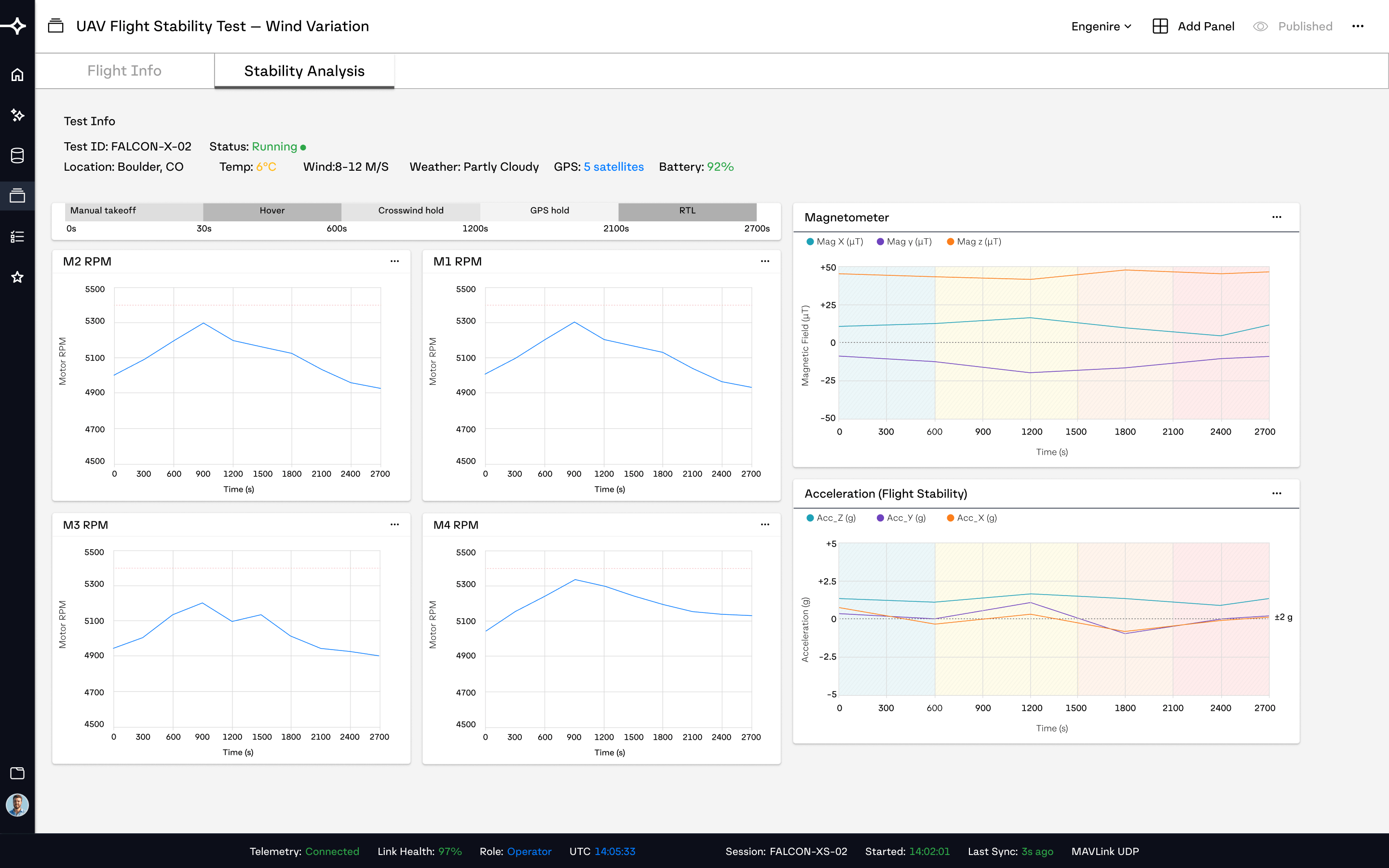
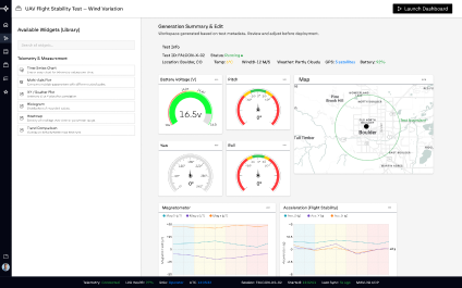
Since this project was inspired by Nominal IO, the UI is designed to integrate into their program.
09
TAKEAWAY
Using an empty chatbox to prompt AI is closer to writing code without context. It's easy to mess up.
Although this started as a project about generating telemetry dashboards, I found myself focused on a bigger problem: how we communicate with AI in the first place. ATW has inspired me to explore more ways to make prompting intuitive and streamlined.
The other takeaway: test before you give up. I wasn't confident this would work until I ran the first test. It failed — which taught me what was missing, and pointed directly at the context library. Testing early, even when you expect it to fail, is how the real problems surface.
ADAPTIVE TELEMETRY WORKSPACE · ABENEZER BEREKET
MODEL NO. ATW-01
PRODUCT DESIGN CASE STUDY · 2026
01
OVERVIEW
02
OBJECTIVE
03
SOLUTION
04
RESULTS
05
PROCESS
06
RESEARCH
07
DESIGN
08
WORKFLOW
09
BREAKTHROUGH
10
FINAL
11
TAKEAWAY